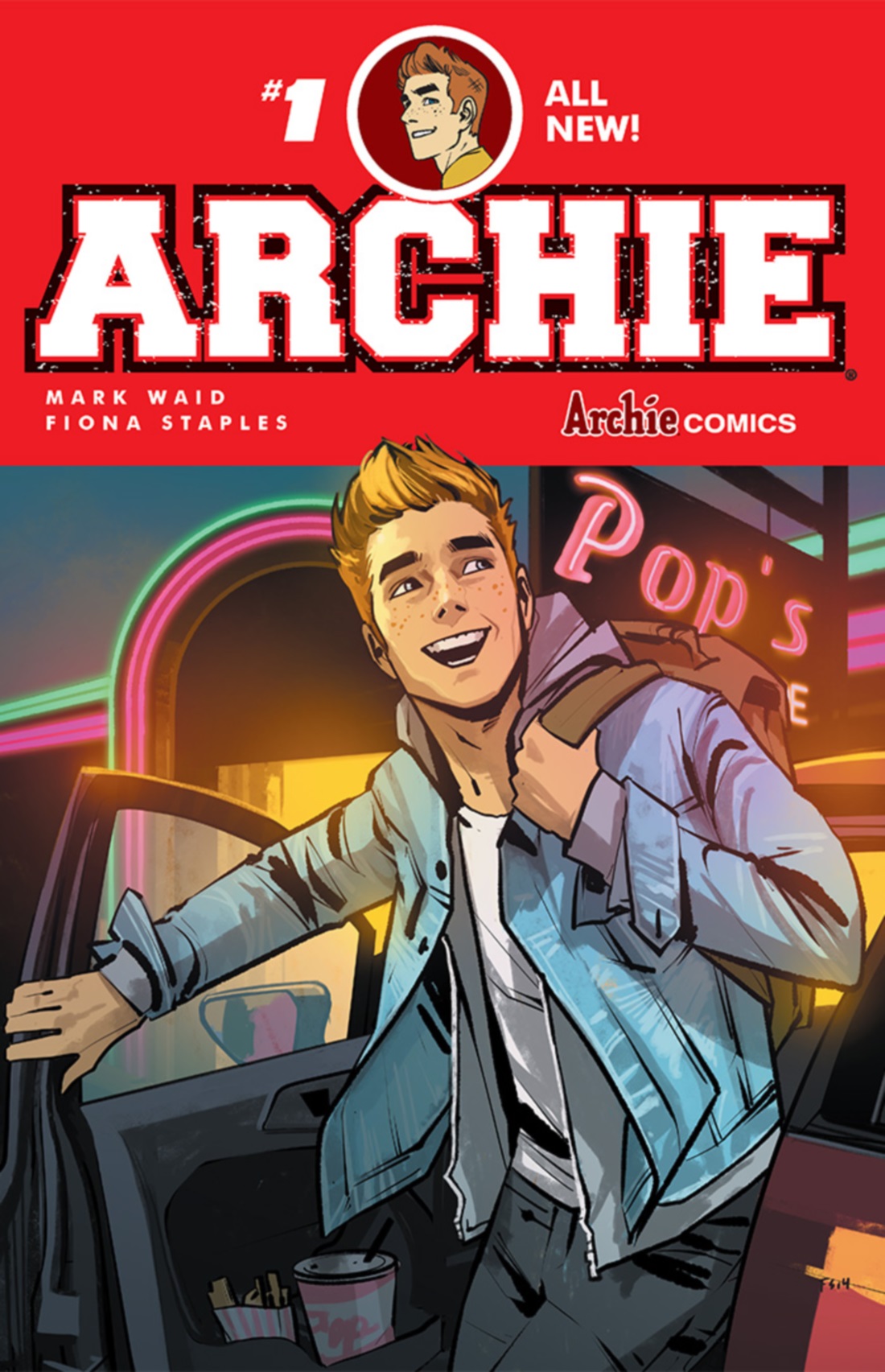
Written by: Mark Waid
Art by : Fiona Staples
Synopsis: Change is coming to Riverdale in this can’t-miss kick-off to Archie’s new ongoing series! Familiar faces return in new and unexpected ways in this must-have #1 issue! As the new school year approaches, you’d think Archie Andrews would be looking forward to classes and fun—but nothing is as it seems in the little town of Riverdale. But is this a one-off or a sign of bigger changes awaiting for America’s favorite teens—and the entire town? Find out in this exciting and remarkable first issue!
My views: First, I have to say I’m a huge fan of Archie Comics. I’ve got a good 40 or 50 digests, plus some vintage ’60s ones graciously gifted to me from a friend. I’ve also been in the process of writing a book proposal on Archie (which, now that I said it, it means I’ve got to get to work on it for real and stop using “work” as an excuse!) and I’ve nursed dreams of writing and drawing for the comic book company. I’ve also met Dan Parent, the creator of Kevin Keller and learned some things about the business that I didn’t know. Before all of that, though, I wrote a paper in my freshman year of college on how Archie Comics could get into the 21st century and in my last years at college, when I created Moniqueblog.net, I created a huge shrine to Archie Comics, with special sections for Jughead and Valerie. In short, I’m a huge Archie Comics nerd. (And I’ll probably have to fish some of those articles up for future re-postings here.)
How amazing has it been, then, to see that a lot of what I wrote in my college paper has come to pass in recent years, culminating in Archie #1. So many of my original concerns—the lack of diversity among the main cast and the under-utilization of the diverse characters in the secondary and tertiary casts, the stodgy stories that seemed like they were from the ’80s, the lack of current clothes, and the general feeling of the company being run by an out-of-touch old set of white men—has completely dissipated in this new look at Riverdale.
No longer is Archie Andrews someone I despise. Yes, even though I loved Archie Comics, I hated Archie Andrews. He was a misogynist, and that’s being as kind as I possibly can to him in his past life. The idea of him having two girls fight over him and no one see anything wrong with it is purely a man’s fantasy. Archie was created in a very misogynistic time, so it makes sense that the men running the joint would think that the conceit was funny and entertaining, not demeaning and objectifying.
In Archie #1, though, Archie is presented as the every day teenager in the 21st century, who is figuring who he is and how he fits into the world. He’s likable, especially since he’s also not a misogynist; the triangle has now been broken FOREVER! Archie had been with Betty since they were in kindergarten, and the inaugural issue opens with Archie and Betty breaking up over mysterious, yet firm, reasons. Both of them feel weird about it though, and we (along with Kevin and two other girls, one of whom definitely appears in the special Clash of the New Kids editions spearheaded by Dan Parent) don’t have any idea what the conflict—called the lipstick incident—is. We also haven’t even met Veronica, who has yet to move to Riverdale (we do see that Lodge Industries is coming to town, though).
Speaking of Clash of the New Kids, several characters from those special issues, as well as relatively new characters like Raj and Valerie’s brother Trev, make appearances in Archie #1. Not only do they serve the diversity quotient old Archie issues chronically lacked, but they also are given their moments to show that they aren’t just filler characters; even without saying much or anything at all, the life Fiona Staples brings to the characters through her drawing shows that these characters are well-rounded people with their own flaws and successes. I’m hoping we’ll get to see even more of them as the issues progress.
Much of Archie #1‘s success is due to Staples ability to imbue a classic “Hollywood teenager” look to the characters (think Clueless or Beverly Hills 90210) while bringing them fully into the present with their clothes, hair, and wide range of expressions.
There are still some vintage Archie-isms at work, such as Archie’s letter jacket and converses, Reggie’s greaser look and Jughead’s fedora crown and slacker look, but these mid-century touches have been upgraded to today’s fashion sense. Reggie’s greaser look is both ironic and a power grab, as if he cultivated his look from Balenciaga. Jughead’s slacker look is even more punkish than it initially was, with his ratty sweatshirts and ripped black jeans. Archie still has that Happy Days look to him, but his style seems less like a uniform and more like a kid who was influenced by today’s fashion, which pulls from all time periods (for instance, I’ve bought a letter jacket and a monogrammed sweater from Forever 21).
Staples has already made waves for her work on the Saga series, and I’m so happy Archie Comics has tapped her to be the artist for the new Archie series. When I was in college, giving my go at re-jiggering the Archie characters, I was shooting for what Staples has managed to create on the page.
Success is also owed to Mark Waid, who really gives the characters their speaking spark. The one thing that would get on my nerves about old Archie books from the ’90s and even just last year would be certain bolded words like cell phone or computer, as if no one used those things on a regular basis. It showed that some of the people behind the issues were out of touch with the kids they were making books for. Now, though, Waid’s words firmly plant Riverdale in 2015. References to AC/DC’s Angus Young and scribbled out swear words are just some of what revives Riverdale as a town living in current times. I’m presuming he scripted some of the non-verbal moments as well, such as Raj using his phone to shoot movies (in old issues, Raj was using a video camera)and Raj and Archie shooting the bull over video games. Whether or not he came up with those moments or they were a collaboration between himself and Staples, these moments also go far in keeping the characters relevant.
I also have to give special shout-outs to the colorists, Andre Szymanowicz and Jen Vaughn, and the letterist, Jack Morelli. The vivid coloring compliments Staples’ lines and the lettering, even though it’s similar to the font originally used by Archie Comics, still feels new and current.
Overall, I give this book a HUGE two thumbs up. It’s reignited my love for Archie Comics, and I can’t wait to see what the next issue brings.